 As we prepare for the coming semester, we are offered yet another opportunity to iterate on our instructional materials and approaches. Some instructors are creating new materials while others are modifying the pre-existing ones. We’d like to offer you a quick checklist along with some considerations for improving accessibility and providing alternate modalities from which students can learn and review.
You may be asking yourself why we would suggest accessibility in PowerPoints when talking about video. Aside from the readability of the slides, linking to the PowerPoint presentation offers students an alternate method for learning and studying the material. This also allows for screen readers to access the presentation which otherwise would be unavailable, and because we frequently use PowerPoints, much of the work is already complete.
PowerPoint
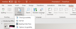
- The Accessibility Checker, found under ‘Review’ at the top, is a great tool to double check that you haven’t missed anything. This is also a good starting point when updating your materials.

- Use the built-in slide templates which have been properly set up for screen readers. Alternatively, you can use the Reading Order pane, found under the Accessibility Checker, to set the order in which a screen reader will read each item on a slide.
- Use Alternative Text/Descriptions for images by right-clicking an image and selecting ‘Edit Alt Text’; Make sure any alternative text is detailed enough to convey the content presented in the image.
- Avoid using tabs and indentations for organizing. Instead, stick to left aligned text and use bulleted or numbered lists.
- Make sure the color of the text vs the color of the background is high in contrast.
- Avoid the use, especially overuse, of animations/transitions.
- Avoid pasting in URLs or linking the words “Click here”. Instead make the link out of meaningful phrase or sentence. (e.g.: Van Gogh painted several views from his bedroom window and The Starry Night is the only nocturne in the series.)
- Tables, Charts, Graphs should get their own separate slides each.
Canvas & Kaltura
- Upload your PowerPoint file and provide links to them where the videos are embedded on your course site.
- Use the auto-captions in Kaltura and correct any mistakes in those captions.
- Use descriptive speech to explain what you are doing/demonstrating or what is occurring on screen to help students who are blind understand what is occurring without having to guess by context.
- Consider being visible while recording. Not only are some hearing impaired very good at lip reading, but this also offers a human connection in times where people may feel distant even though we are sharing spaces.
Other Considerations
- Provide a glossary of terms beforehand to reduce cognitive load on students trying to understand new terminology.
- Check any linked external content to see how accessible it is and whether you might find an alternative source.
If you have questions about how to make your instructional materials more accessible, contact us at citl@indiana.edu.

Leave a Reply