Nearly everyone has heard of the phrase “don’t judge a book by its cover”, or something similar, in their lifetime. A straightforward idiom usually meant to comment on how people should look at others beyond the surface, since it is an innate behavior all humans do. We make assumptions of others based on the biases or stereotypes associated with almost everything: social groups, nationality, clothes, and even the kind of hobbies one has will create a positive or negative association just upon the first time meeting someone.
However, when we take the meaning of this phrase literally, does this definition still hold the same merit? While it’s always good to practice seeing the value in something past the way it looks, for many products and forms of media, making a good visual first impression can make or break the success of what the design is attached to. A spectacular design gets everyone talking, and so will an awful design… the phrase “any press is good press” may not apply depending on just how bad it is. To test this, let’s go over some examples to discuss what makes or breaks an eye-catching design.
Movie Posters
For movies, other than trailers and commercials, the poster plays an integral role in advertising. If a viewer has not seen the trailers or commercials, the poster is the next in line to entice a viewer to watch. This can also apply to the DVD box art, or thumbnails on streaming services, but for theater releases a poster is a must. With this, however, trends are fairly noticeable since movie poster designs tend to follow a similar format across genres.
For example, action movies – particularly in the superhero subgenre – will often have a large ensemble of prominent characters stacked on top of each other (Marvel posters have become infamous for this).
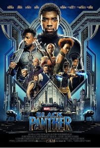
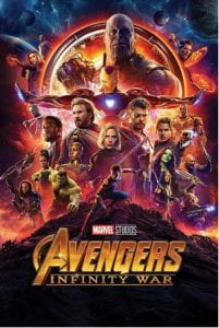
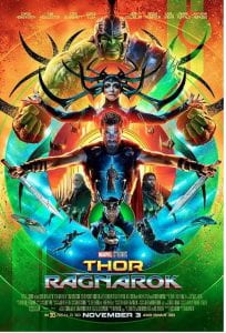
Credit: Marvel
While trends don’t inherently make a bad design, it can become repetitive and oversaturated, especially if similar movies are being shown within the same time frame. A unique take on this trend has been done for the movie Everything Everywhere All at Once (2022). While not primarily an action film, several characters are featured and are organized with a similar stacking format. In combination with the chaotic, psychedelic-inspired stylization, a viewer can infer that the movie will have a lot going on – the viewer decides whether that is a plus or negative for them!

Credit: A24
Album Art
The art of an album typically doesn’t much matter to those who already know which artists or songs they want to listen to, but it can certainly elevate the experience if the album cover is pleasing to look at (with vinyl in particular gaining the most visual benefit). However, for those who are unfamiliar with an artist or are seeking out something new, the final decision can sometimes come down to whether or not an album cover looks aesthetically pleasing or interesting. The cover has the job of portraying what kind of listening experience the album offers; a more abstract or alternative sound tends to come with art that displays a similar conceptual style, such as Tame Impala’s “Currents” (2015). An album that has more personal themes are likely to feature the artist themselves on the cover as a focal point. Adele is a prime example – nearly all of the artist’s album and single covers are simply a photograph of her face or full-body shot.
One album that takes a little bit of both previously mentioned features to aid the album art is SZA’s SOS (2022). The cover composition is quoted by SZA to be directly inspired by a photograph of Princess Diana taken in 1977, where Prince Diana is seen sitting on the very end of the diving board on a yacht during a trip in Italy. The artist has said that she chose this same pose since it created a sense of isolation and loneliness. If the visual of an album cover is able to properly display the messages and emotions present in featured songs, it is more likely that listeners who are seeking that type of music will quickly gravitate towards choosing it.

Credit: Top Dawg Entertainment / RCA Records
Finally, we reach the final and most straightforward example of media where the cover can influence or dissuade a chance. Although other forms of media have their own challenges when it comes to grabbing a buyer’s interest, books likely have the most to lose since there are hundreds of styles and trends that have followed books, especially genre wise. If you ask someone to imagine the cover of a typical romance novel, for example, among the first associations will likely be of the protagonist couple embracing, against a photo background that has been edited in a way that looks fairly jarring.
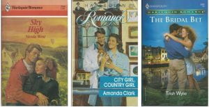
Credit: Harlequin Enterprises ULC
Enjoyment of a book cover is subjective, and there are likely people who will enjoy a certain style even when there are common opinions of a trend being seen as cheesy or overdone. There are, however, unique ways to shake up the composition of a book cover, even if the cover is primarily using typography. Unlike the previously discussed forms of media, book covers almost always must utilize typography to showcase the book’s author and title. It is the first source of information a reader will gather regarding a book, so if both don’t particularly pique interest at first, the next line of defense is the cover itself. Outside of non-fiction and informational books, having a minimal or bland usage of aesthetics may cause a reader to look elsewhere, even if they do decide to read the book’s blurb on the back or inner cover. Therefore, it doesn’t hurt to try something visually interesting even if there is little text to work with.

Credit: Christopher Brand, Matt Vee, Jennifer Carrow
Another thing that makes book cover design unique is that for certain genres – mainly classic or established children’s series – it is common for redesigns of the book’s cover to occur over time. The styles of these redesigns can range greatly, but they can also share a goal for the reasoning of a redesign. A collection of classic literature cover redesigns by illustrator Mikey Burton, for example, were composed in a “modernized” way to catch the attention of younger readers.
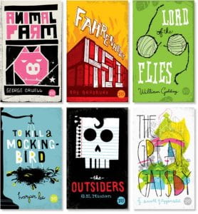
Credit: Mikey Burton
Final Judgements?
While not everyone will consider visual presentation to be important in regard to the media they enjoy, just as it is with human nature, a first glace can sway an opinion fairly quickly. In this widely digital age, many of us are given too many options for entertainment to properly experience them all. So, if two books have a similar premise and similar critical reception, a good design can cause one book to be chosen over the other. However, that’s not to say that a “bad” or unusual design will hinder the success of a product. While taste is always subjected, the following images show examples of media where while the content is generally enjoyed or acclaimed, the art is considered the weakest part of it.
From left to right: X-Men: First Class (2011), Glory – Brittany Spears (2016), The Great Gatsby by F. Scott Fitzgerald (1925).


Credit: 20th Century Fox / Marvel, RCA Records, Charles Scribner’s Sons
In your daily life, consider looking at the pieces of media you have and which you consider favorites. Beyond the content of the material, can you find a trend in styles and aesthetics you enjoy? Visual art can connect us in ways that the movies, music, and books that we enjoy do too. However, also consider pieces of media you enjoy that may look less than quality on their surface level. Even if aesthetics can help prepare a very nice first impression, the content of the material should still be the most important factor of what you base judgements on.
The same can be said for people – humans are far more complex than what the surface level tells you. With this in mind, consider your own biases and judgements you have when you look at one’s “cover”. Even with existing trends and stereotypes, not one person fits a singular mold of what society deems that their communities should act or look like. Just like how we are drawn to certain aesthetics in art, we should examine the types of people we are drawn towards and whether we – unintentionally or not – exclude others on the basis of their “cover” before knowing what’s beyond the first page.
Leave a Reply